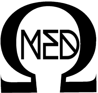
The project was to create a logo, T-Shirt, symbol, cd face, and CD cover for Omega Ned.
http://www.1001fonts.com/woodwarrior-font.html (free for commercial use)


Due to technology issues the work from this lesson disappeared so I recreated it the next week-
This is the logo design I will be going with.
This is another option that I could go with
 This is my CD face
This is my CD cover.
 This is my T shirt design
This is my symbol
I thought that the final piece met the brief requirements as I tried to incorporate Shrek into the designs- which is what the artist wanted, and I completed all designs that he wanted.
This is the feedback that I received from Omega Ned: "The logo comes across as well professional here and I could see me using something like this. Like the way the CD face artwork has adapted this logo into the on face artwork. T Shirt and symbol are good, but would have liked more visual material for the actual CD cover."
The client was satisfied with the logo, CD face, T Shirt and symbol, however wasn't as pleased with the CD cover. I thought that simple was better when it came to the CD cover which is why I kept the design simple and just used the same design as the CD face.
I felt that the final piece did meet the target audience needs as the added Shrek ears let the audience know a bit more about Ned as an artist.
In terms of the clients feedback the logo, CD face, T Shirt and symbol were successful, whilst the CD cover was unsuccessful. I would agree with the client on this feedback as I spent time on the designs of the successful four but had ran out of time and ideas by the time it came to the CD cover so I just used the same design as the CD face.
My time management was not very good when completing this project as I spent too much time idea generating on the logo when we were given the project at first.
I did not effectively liaise with the client as he did not want personal contact with us, however I tried to stick to the brief he sent my teacher as closely as possible.
If I were to repeat the project again I would give each design an equal amount of time that I spent on it rather than rushing the last one.
I feel positively about the project and personally believe that the designs I created were up to professional standards compared to other artists' designs. Below is the symbol and logo of The Vamps, as they are where I got the inspiration to make my symbol and logo simple but memorable.


No comments:
Post a Comment